Tucson Florist
This project was for my "Create High-Fidelity Designs and Prototypes in Figma" course as part of my Google UX Design Professional Certificate. The study's objective was to create High-Fidelity Designs and Prototypes in Figma.

Project duration: August 2021 - May 2022
My role: UX Designer - designing an app for Tucson Florist from conception to delivery.
Responsibilities: Conducting interviews, paper and digital wireframing, low and high-fidelity prototyping, conducting usability studies, accounting for accessibility, and iterating on designs.
The Product
Tucson Florist is a regional florist located in downtown Tucson, AZ. Tucson Florist strives to deliver healthy, fresh flower bouquets to all of Arizona. They offer a modern approach with fast delivery. Tucson Florist targets customers who want more information about the meaning, care instructions, and pet safety before the purchase.
Project Overview
The problem: Young adults who lack knowledge of what they want in flowers for a special person.
The goal: Design an app for Tucson Florist that quickly allows users to buy flowers for their loved ones without prior flower knowledge.
User Research
I conducted interviews and created empathy maps to understand the target users and their needs. A primary user group identified through research was young adults who buy flowers as gifts for their loved ones and are confused as to the appropriate types of flowers for each occasion.
Research also revealed that when users buy using online platforms, it is difficult to conceptualize the product's size and how it would look in person, making them feel insecure about sending a gift too small or too big or not the right color. Another major problem is the lack of price comprehension.
Pain Points
.png)
Knowledge
Young adults do not know much about the meaning, care instruction, and pet safety.
.png)
Insecurity
Platforms for ordering flowers make it hard to gauge the reality of the final product before sending it as a gift.

Pricing
Transparent price information online is difficult to find.
Personas
Problem Statement: Eduardo
Eduardo is a young Mechanical Engineer who needs a basic understanding of the types of flowers required for different occasions, prices, and reliable sizing because buying flowers online is overwhelming and unclear

User journey map
Goal: A reliable and accurate online flower store for gifts

Problem Statement: Alicia
Alisia is a cat mom who likes to decorate her house with real flowers and needs to feel secure buying flowers that are pet friendly because she does not want to risk the health of her pet.

User journey map
Goal: Buying flowers at the supermarket that are safe for her cat

Starting the Design
Paper Wireframes
Taking the time to draft iterations of each screen of the app on paper ensured that the elements that made it to digital wireframes would be well-suited to address user pain points. For the home screen, I prioritized a quick and easy ordering process to help users save time.
Stars were used to mark the elements of each sketch that would be used in the initial digital wireframes.

Digital Wireframes
As the initial design phase continued, I made sure to base screen designs on feedback and findings from user research.
Easy navigation was key addressing user needs in the designs in addition to equipping the app to work with assistive technologies.
Low-Fidelity Prototype
Using the completed set of digital wireframes, I created a low-fidelity prototype. The primary user flow utilized was: finding and ordering a bouquet. The prototype could then be used in a usability study.

Style Guide

High-Fidelity Prototype
The final high-fidelity prototype presented cleaner user flows for finding and ordering a bouquet. It also met user needs with all information required for the buying process.
Tucson Flower's high-fidelity prototype

Round 1 Findings
-
Users wanted to have price information prior to purchase.
-
Users wanted a visual action to confirm their selection.
-
Users felt more secure keeping track of an order through email notifications/confirmation.
Round 2 Findings
-
The "Order Submitted" pop-up wasn't working properly.
-
The “Choose your delivery date" was confusing
-
Users wanted to know more about the chocolate option
Findings
I conducted two rounds of usability studies. Findings from the first study helped guide the designs from wireframes to mockups. The second study used a high-fidelity prototype and revealed which aspects of the mockups needed refining.
Refining the Design
Mockups
Early designs allowed for some customization. However, after the usability studies, I added information about the price for each size and visual confirmation of selection. I also revised the design so users could see all category options when they first land on the screen.
The second usability study revealed frustration with the checkout flow. To streamline this flow, I added a calendar option for choosing the delivery date and a chance to edit the quantity.
I also added information about the chocolate option and information about the price.


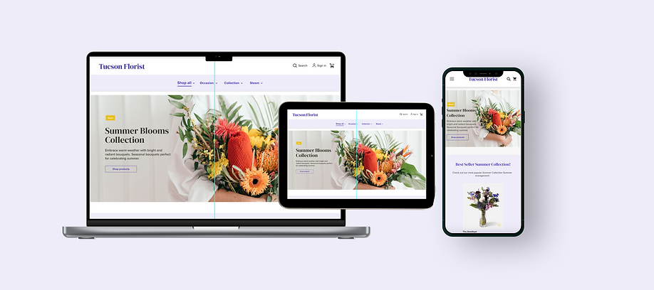
Tucson Florist Responsive Website
Starting the Design
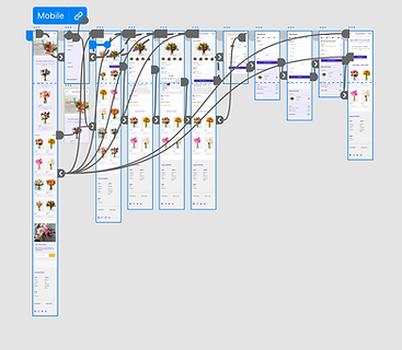
Sitemap
Difficulty with website navigation was a primary pain point for users, leading me to the creation of a sitemap.
My goal here was to make strategic information architecture decisions that would improve overall website navigation. The structure I chose was designed to make things simple and easy.
.png)
Paper Wireframes
Next, I sketched out paper wireframes for each screen in my app, keeping in mind the user's pain points about navigation, browsing, and checkout flow.
The home screen paper wireframe variations to the right focus on optimizing the browsing experience for users.

Paper wireframe screen size variations
Because Tucson Florist customers access the site on a variety of different devices, I started to work on designs for additional screen sizes to make sure the site would be fully responsive.


Digital Wireframes
Moving from paper to digital wireframes made it easy to understand how the redesign could help address user pain points and improve the user experience.
Prioritizing useful button locations and visual element placement on the home page was a key part of my strategy.
Low-fidelity Prototype
To create a low-fidelity prototype, I connected all of the screens involved in the primary user flow of adding an item to the cart and checking out.
At this point, I received feedback on my designs from my team members about items such as the placement of buttons and page organization. I listened to their feedback and implemented several suggestions in areas that addressed user pain points.
View Tucson Florist's low-fidelity prototype

Findings
These were the main findings uncovered by the usability study.
Product
Users want to have an estimate of the delivery cost before checkout.
Account
During the checkout process, there wasn’t a clear way for users to checkout as a guest.
Confirmation
Users feel more secure tracking an order through email notifications/confirmations.
Refining the Design
Mockups
Based on the insights from the usability study, changes were made to improve the site's checkout flow. One of the changes implemented was adding the option to add a location like a zip code, city, or address. This allowed users to estimate the delivery cost before the checkout.
To make the checkout flow better, I added a new CTA to allow users that don't have an account or don't want to create one to have access to the checkout process as a guest.
Considerations for additional screen sizes were made in the mockups based on earlier wireframes. Because users shop from various devices, it was important to optimize the browsing experience for a range of device sizes (ex. mobile, tablet, etc.) to provide users with the smoothest experience possible.

High-fidelity Prototype
My hi-fi prototype followed the same user flow as the lo-fi prototype and included the design changes made after the usability study and several modifications.
View the Tucson Florist's high-fidelity prototype web version.
View the Tucson Florist's high-fidelity prototype mobile version

Accessibility Considerations
Provided access to users who are vision-impaired through adding alt text to images for screen readers.
Used icons with the name on it to help make navigation easier.
Used detailed imagery for bouquets and reading information to help all users better understand the designs.
Going forward
Impact:
The app makes users feel like Tucson Florist thinks about how to meet their needs.
A quote from peer feedback:
“I really enjoy the coloring and overall design of the app. Its interfaces are very simple and easy to use.
What I learned:
While designing the Tucson Florist app and the responsive website, I learned that initial ideas only represent the beginning of the process. Usability studies and peer feedback influence each iteration of the app’s designs. I also gained exposure to user pain points and the importance of user feedback in design.
Next steps
1.
Conduct follow-up usability testing on the new website
2.
Identify any additional areas of need and ideate on new features